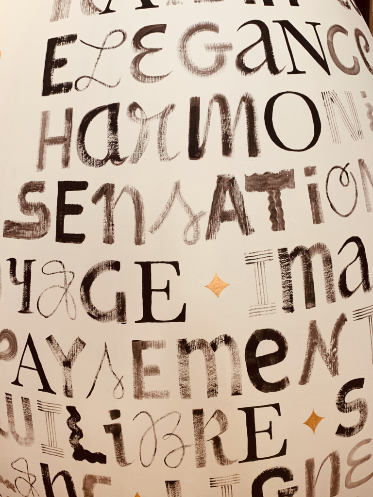
Writting letters with Morgane Saintorens and Helene Parriel. We have been asked to imagine the decoration of a wine tank, in Chateau Larrivet Haut Brion. The theme was calligraphy, and emotions. Morgane and Helene, imagined a composition made out of different letters, and created a beautiful texture keeping the wine glass shape empty. The result was astonishing, and it was a very exiting project for the studenst as well as for me. During three days in a very cold weather, they wrote letter after letter.
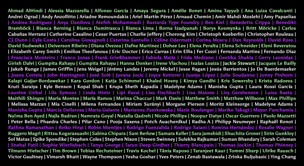
The Alphabettes Mentorship program aims to help people, especially students and professional newcomers, to immerse themselves in the industry. Since 2020, I have been a mentor in their program. It has been a fantastic experience in many ways. I hope to be posting some of the works we have been doing with the mentees anytime soon. In the meantime Check out their inspiring website. https://www.alphabettes.org/
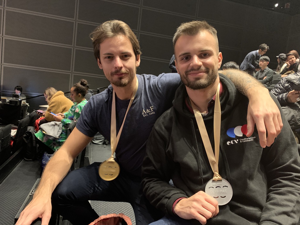
President of l’ASPaC, Mr. Fumi Sasada, (http://www.aspac.jp/), CEO of epda member Bravis International, was head of Olympac 2019, a live design competition for students. They had 105 minutes only to work on a specific packaging design topic. 18 countries and regions took part. A student from ECV, Pierre Antoine Cossard, represented France, and won the sylver medal. https://www.ecv.fr/olympac-2019-medaille-dargent-pour-lecv/
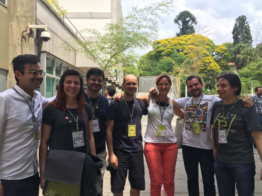
Atypi São Paulo 2015, gathered so many different people from different backgrounds and companies together in one place around typography, sharing the new studies, very high level workshops and mostly the fabulous exchanges it generated around letters in all their forms and in all the languages. I strongly believe it is an unique experience, that wakens inspiration, and opens to new perspectives.
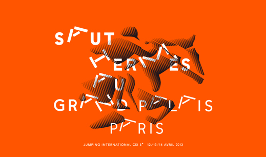
Né à Paris en 1962, Philippe Apeloig poursuit des études de graphisme à l’École supérieure des arts appliqués « Duperré » et à l’École nationale supérieure des Arts Décoratifs (Ensad). Il entre en stage chez Total Design à Amsterdam, puis collabore avec April Greiman à Los Angeles. Fondant son propre studio à Paris, en 1989, il travaille essentiellement dans le champ culturel – Carré d’Art de Nîmes, Culturesfrance, Institut national d’Histoire de l’Art (INHA), musée d’Art et d’Histoire du Judaïsme, musée du Louvre, musée Rodin, théâtre du Châtelet, etc. Il se singularise notamment par un emploi renouvelé de la lettre et par…
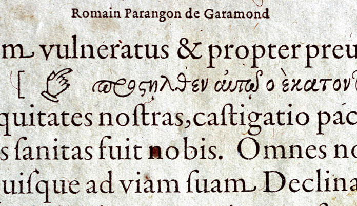
Les innovations d’ Alde Manuce Depuis 1465, il existe des caractères typographiques reproduisant l’écriture des humanistes italiens. Très clair et très lisible, ce type d’écriture connaît un grand succès en Italie jusqu’à la fin du XVe siècle. Il se caractérise par son aspect artisanal, « la fermeté de son tracé, une certaine rusticité d’allure due au faible contraste de ses pleins et déliés» (R. Ponot). L’un des plus beaux modèles de cette lettre est le romain gravé en 1470 par un Français expatrié à Venise, Nicolas Jenson. À l’extrême fin du XVe siècle toutefois, le dessin des caractères romains va être considérablement amélioré….
Oct 29 2014 This Month In Typography Please find the complete article in http://ilovetypography.com/2014/10/29/this-month-in-typography/ Welcome to this month’s roundup of type-related info and entertainment. Today, we learn some important typographic pronunciations, figure out how to work with layered web fonts, watch Mark Simonson talk about offset lithography, revisit the 1970 New York City Transit Authority graphics standards manual, see what medieval scribes were doodling in the margins of their texts, read up on the printing trade in India, check out some fonts based on the handwriting of the homeless, see a typewriter modded to use Comic Sans, learn how to make graffiti…
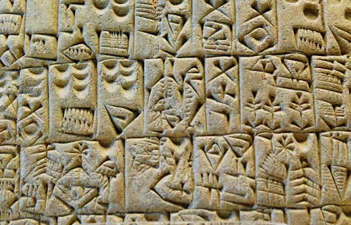
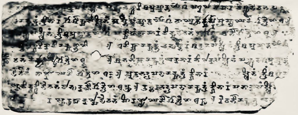
Partie 1 – Des premières écritures jusqu’à la période de Gutenberg
« Ce n’est pas notre cerveau qui a évolué pour permettre la lecture, ce sont les systèmes d’écriture qui ont évolués pour permettre à notre cerveau de s’y adapter. » Sylvie Ferrando. Octobre 2007